Task
Research the work of graphic designers in contemporary music graphic design and/or lifestyle magazines and branding.
In this task I am researching the work of designers in music, especially in the UK, following the Punk movement.In the 1970s the British economy was failing. Young people at the time wanted to rebel against the government and this started to come through in their music. They aimed to shock and had a very strong DIY ethic, with other views including not 'selling out', non-conforming, anti-authoritarianism and individual freedom.
Punk rock was a slipshod music style, consisting of small bands usually with a lead vocalist, one or two electric guitarists, an electric bassist and a drummer. Often the instrumentalists in the band would provide back up vocals in the form of shouts and chants. Punk rock songs are usually short, just a few minutes long, comprising of maybe three or four chords loosely strung together.
 |
| Figure 1, Never Mind the Bollocks, Jamie Reed, 1977 |
The Sex Pistols logo actually came about by accident- according to Malcolm McLaren anyway. While living with a friend called Helen Wellington Lloyd, he was producing leaflets to promote the band, and she would help him with them.
"She used to smoke a lot of dope, and she'd just get so spliffed up that she couldn't be bothered to go to the shops and buy Letraset, so she decided to cut out newspaper letters instead and make the band's name look like a ransom note. It just goes to show the best ideas are not alwyas conciously formed. It fitted the anti-commercial attitude of the band perfectly." 1However the designer Jamie Reid contested this. In his version of events, the logo was achieved by a lack of money; the visuals had to be cheap and fast, and collaged type was the best way of doing this.
"At the time, we had to produce cheap (no money), fast, and effective visuals, so collage was the dominant look; things cut out from papers and magazines- photos and lettering- which was the so-called 'blackmail punk' look, which looked great." 2Malcolm Garrett who designed many of the Buzzcocks album designs also incorporated a lot of collage into his works. He was directly influenced by Russian Constructivism posters, and especially by the work of El Lizzitsky, who worked with geometric shapes and triangles combined with straight lines and dramatic forms.
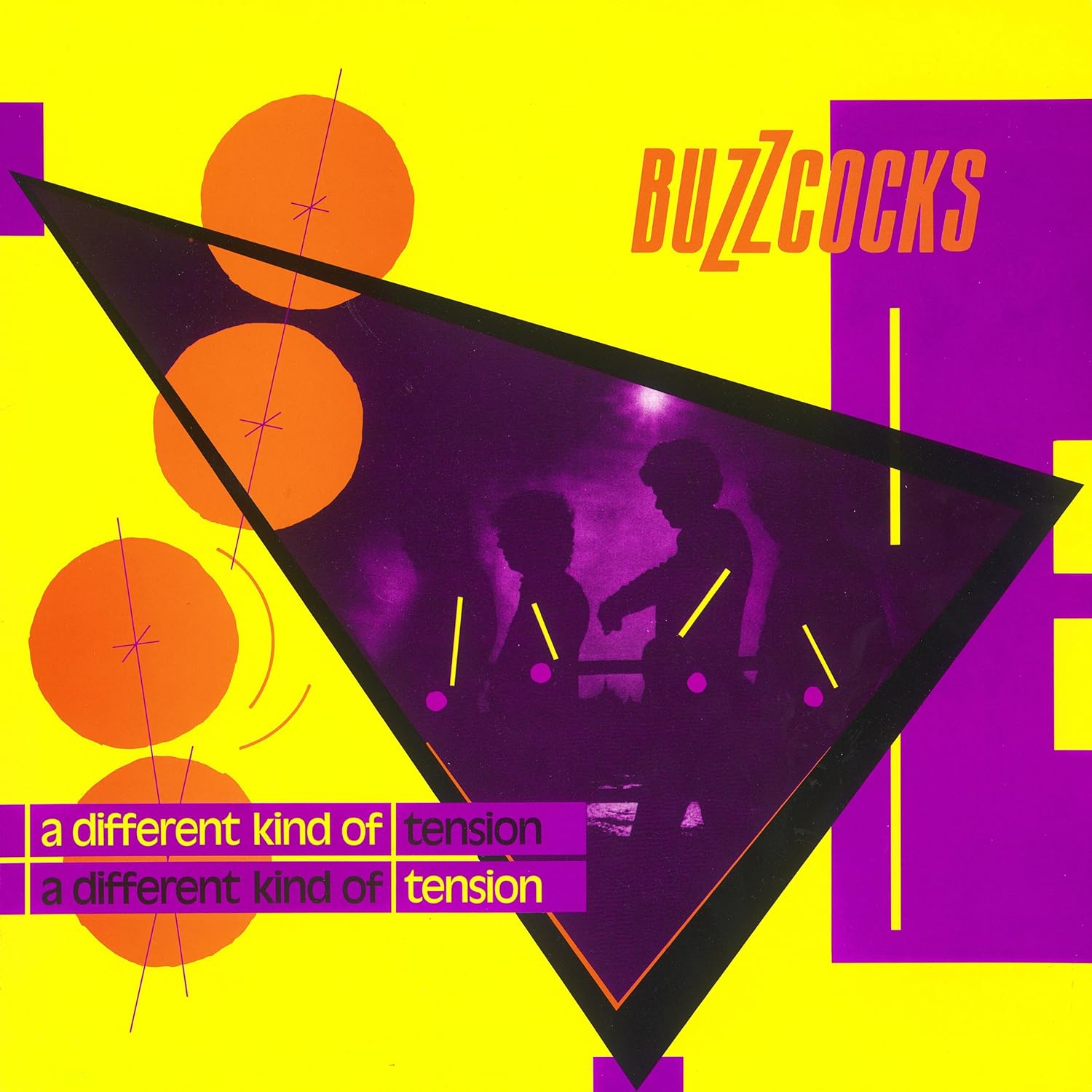 |
| Figure 2, A Different Kind of Tension, Malcolm Garrett, 1979 |
Garish, clashing colours have been used, just like in the day-glo bright sleeve of Never Mind the Bollocks (Figure 2). Designers
were experimenting more with colour at this time, using uncomfortable
colour combinations which in theory should have been disastrous but in
practice suited the message and ethics of the bands- loud, in your face,
and not going anywhere soon.
 |
| Figure 3, Movement, Peter Saville, 1981 |
Of
all the contemporary graphic designers, Peter Saville is definitely one
of the best known. Producing album covers for Joy Divison and New
Order, he gained rapid popularity in the music world.
His
album covers were sleek and sophisticated, communicating a much more
mature and adult message than the raw punk albums. In the above New
Order album design (Figure 3), in contrast to both the Sex Pistols and
Buzzcocks, it uses harmonious colours which are unnoffensive to the eye
and a simple but well thought-out design, and the streamlined design of
the below Joy Divison cover also shows this (Figure 4).
 |
| Figure 4, Unknown Pleasures, Peter Saville and Joy Division, 1979 |
"During this period, while the rest of the general design palette turned Day-Glo, Saville's own tastes veered more toward the classical." 3
List of Illustrations
Figure 1, Never Mind the Bollocks, Jamie Reed, 1977, THORGESON, S. & POWELL, A. 100 Best Album Covers, Dorling Kindersly, 1999, p.p. 106-107Figure 2, A Different Kind of Tension, Malcolm Garrett, 1979, THORGESON, S. & POWELL, A. 100 Best Album Covers, Dorling Kindersly, 1999, p. 47
Figure 3, Movement, Peter Saville, 1981, KING, E. & YORK, P. Designed By Saville, Freize Publishing, p. 69
Figure 4, Unknown Pleasures, Peter Saville and Joy Division, 1979, KING, E. & YORK, P. Designed By Saville, Freize Publishing, p. 129
References
[1] THORGESON, S. & POWELL, A. 100 Best Album Covers, p. 106[2] THORGESON, S. & POWELL, A. 100 Best Album Covers, p. 107
[3] KING, E. & YORK, P. Designed by Saville, p. 13
Bibliography
KING, E. & YORK, P. Designed by Saville, (2003) Freize. LondonTHORGESON, S. & POWELL, A. 100 Best Album Covers, (1999) Dorling Kindersly. London