Tuesday, 25 November 2014

Week 10- Gendering the Image

Research the work of a male and a female illustrator and identify any differences pertaining to typical gender theory in art.


Historically, it has been fairly easy to identify the gender of the creator of a piece of art; there were clear 'rules' and guides which could help pinpoint who it was that made that image. 

For example, male artists would tend to over-sexualise the female form, and glorify them in a beautiful and objective way. Emotions and allegories within the art would be passed over in favour of aesthetic appeal and erotic value, whereas female artists would be more sympathetic to the feelings within an image. They would also portray the female form in a much more philosophical way, often including some kind of message behind the work; along with this, the form would represent a much more 'honest' woman, raw and unpolished instead of a beautiful but flat image.

Nowadays I would say the line between an inherently 'male' or 'female' piece of work has been blurred to the extent that it's impossible to say any one artist is any one gender. Of course they have a biological gender no matter what, but the brain is much more fluid in its ideals and through the ever-changing attitudes of society and the constantly challenged 'social norm', a lot of artists mix and match qualities of both genders to help get the right message in their work. 

I also think that creative thinking is encouraged more now than ever before in history. This is partly due to new technology and means of exploring and researching culture and art, and the creative industry worldwide is ever-expanding in the wake of thousands of new graduates every year, bringing fresh water to an already gargantuan ocean of creativity.

Tara McPherson

Fig 1- Tara McPherson, Sometimes
I Just Want a Hug,
2005


Tara McPherson is an artist in the genres of fine art and illustration, focusing on images made to exhibit, print and sell.

Typically her images feature a female model, usually in some nontypical setting or plain background. Her images do border on the erotic, often featuring nude figures, but her images try to focus on people and their relationships and provoke thought in their audience.

The aesthetic appeal of her work is strong and although the subject often possesses some macabre properties, a physical attractiveness is present also, thus contradicting traditional standards of what could be created by a female artist. Her use of colour remains sensitive and feminine though, which is what makes the combination of physical beauty and psychological reasoning work so well.
Fig 2- Tara McPherson, Love Blows, 2005


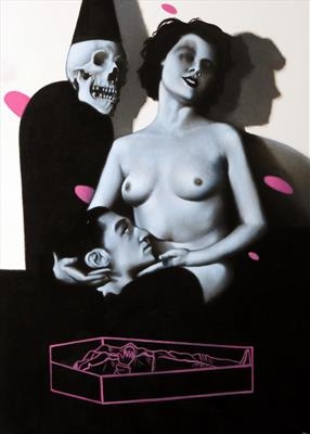
Steve Lawson

Fig 3- Steve Lawson, Till Death


Steve Lawson is another artist who crosses the lines of illustrator and fine artist. This type of mixture of genre seems to yield fantastic results of imagery combined with concept- again, although the artist is male, it challenges the common 'male' created image and shows again that in this society the lines between the genders are being less and less solidly defined.

Figure 3 shows (presumably a couple given the title) a severed male head and a woman in a sexually suggestive position and what must be 'death' standing over them. The title suggests the couple are married or bound together in some way, and the use of the colour pink helps solidify this as concept because of the way pink is usually interpreted (as a colour of love, passion and femininity/ feminine emotion). 

Again, these uses of strong imagery and colour help show that the 'gender' of the creator just isn't fixed. Even in my own work I try to strike a balance between concept and execution; I want my bodies to be beautiful but I want the image itself to be an accessory to the message I am trying to make through my art.


Figure 1- Tara McPherson, Sometimes I Just Want a Hug, 2005, E. Minguet Camara, Ultimate Illustration, New York, Harper Collins, 2008, p79
Figure 2- Tara McPherson, Love Blows, 2005, E. Minguet Camara, Ultimate Illustration, New York, Harper Collins, 2008, p78-9
Figure 3- Steve Lawson, Till Death, http://www.stevelawsonart.com/index.aspx accessed 14/1/2015

Week 9- Self Identity and the Creative Voice

Identify my own self-identity and my creative voice.


Self identity is defined as 'the recognition of one's potential and qualities as an individual, especially in relation to social context'. Finding your inner voice can be a challenge, especially in young people faced with many different career and life routes to choose from; even just knowing where you fit in your chosen industry can be a daunting task and a challenge to identify.

At this moment in time, I think it's difficult for me to choose an image that defines me and my work, purely because I don't know exactly what it is I want to do for the rest of my life. My psyche is constantly evolving, incorporating new ideals and philosophies as I continue to learn.

For this reason, it's been hard to put together a concise portfolio; how could I do that, when I have so many different methods and ways of working? I am interested in all aspects of art and design; from illustration and graphic design to textiles, sculpture and architecture. I find that the main constant in my work is my inclusion of allegories and concepts; apart from that, the actual aesthetics of my work remain fluid and ever changing. 


Week 6- Symbolism and Colour in Modern Illustration

Research how the use of colour can influence the interpretation of an illustration.

Color defines our world and our emotions. It is usually seen before imagery. Our eyes are attracted to color to such an extent that the color of an object is perceived before the details imparted by its shapes and lines. [1]
Colour is possibly one of the most important factors to consider within art and design. The use of colour can totally alter the perception of a piece of work, wether for good or bad, and most images work best when the colours used allow the viewer to 'see' the image as a whole.

Fig 1- Henri Matisse, The Red Studio, 1911
An example of how colour can be seen before imagery is shown above, in Figure 1. This painting by Matisse uses an overabundance of red, and at first glance it's what makes the initial impression of the piece, and it requires another look to identify the other objects in the image.

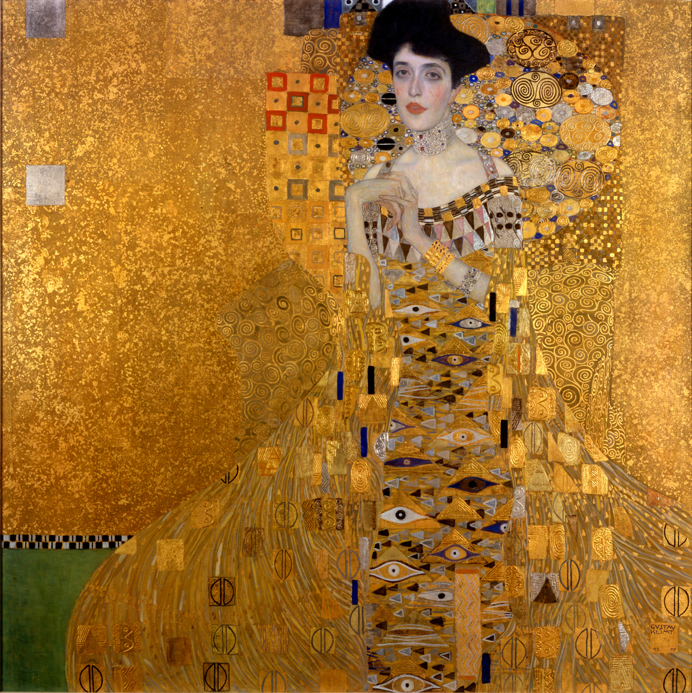
Colour can influence the temperature, atmosphere and symbolism of an image. For example, Gustav Klimt was a master of communicating tones of wealth and luxury through his work, via the use of rich gold hues and blacks and whites to contrast.

Fig 2- Gustav Klimt, Portrait of Adele Bloch-Bauer I, 1907

Figure 2 is a great example of the way Klimt communicates the wealth and luxury of the era he lived in. The textured gold background allows the richly patterned robes of the subject to take attention, whereas the pallid grey-blue skin of the focus competes with this and draws your eyes there first. Strangely enough, the fact that the robes are so detailed and the face so plain causes the viewer to instead focus on the face first, while the jewel tones present throughout the whole of the piece add little elements of interest throughout, rather than it just being one constant colour and texture.

In my own work, I often try to use colour to symbolise certain things. Most importantly I take into account the colour as a whole, and what effect it has on the entire mood of the piece.

                                  Figure 3 & 4, Sophie Babur-Puplett, Carrie's War, 2015

Figure 3 is the image I recently made for one of our briefs. The overall mood of the image is kind of tense in a storybook way; there's nothing too scary or creepy about it and the soft pastels used to describe Carrie's clothes help keep the image child-friendly. The browns I used for the forest branches are a friendly, warm brown, not sinister or malevolent like I would have done for a horror movie poster.

Then take Figure 4 into account; a simple colour change has drastically altered the atmosphere of the image, turning it into a eerily macabre depiction of some spooky conjuring. The jagged border looks sharp and painful, while the forest background is much more ethereal. Carrie herself has the pale blue skin of a recently-dead corpse, and stands out as a ghostly apparition rather than the apprehensive girl she is supposed to be.

The two extremes of this image show just how much colour can affect the way an image is interpreted; certain colours reflect certain values and associations, and this perception of those colours can change the whole meaning of an image.


[1] E. Anderson Feisner, Colour- How to Use Colour in Art and Design (second edition), London, Lawrence King Publishing, 2006,  p2


Figure 1- Henri Matisse, The Red Studio, 1911, E. Anderson Feisner, Colour- How to Use Colour in Art and Design (second edition), London, Lawrence King Publishing, 2006,  p2
Figure 2- Gustav Klimt, Portrait of Adele Bloch-Bauer I1907, N. Harris, The Life and Works of Gustav Klimt, London, Paragon, 2002,  p57

Monday, 10 November 2014

Week 4- Illustration as Object

Research the illustrated products of Fredun Shapur.

Fredun Shapur was an illustrator largely popular throughout the 1960s-80s, and manufactured illustrated toys and games popular with children and adults alike. His works were mainly produced as wooden toys, with printed designs and patterns on them, although he is also known for the illustrated 'play sack' children could dress up in.

Fig. 1- Fredun Shapur, Playsacks
Fig. 2- Fredun Shapur, Placksacks 2
Shapur's Playsacks were the result of being a father- his daughter needed a costume for a play, and using only a kitchen refuse sack, he designed a fantastically creative and appealing pull over children of all ages could enjoy. Being made of paper was also an advantage, as of course after the war economically friendly products were needed while materials were scarcer. 

After the war, most children's toys in Britain were made with plastic or metal instead of the traditional materials such as wood and string. Shapur's primary canvas was wood- his jigsaws and puzzles fitted the form fantastically with their bright, blocky colours and images. Almost first and foremost in his design was the need to play; Shapur believed anybody, anywhere at any age could play, and his toys were designed to challenge and enthral children. The Animal Puzzles he created were a great example of this, and 'favoured high contrast and playful imagery'[1].

Fig. 3- Fredun Shapur, Animal Puzzles
Shortly after the Animal Puzzles came the Four Way Blocks. These were blocks that when lined up, showed a screen printed image of an animal, and when turned, revealed another on each side. 
"Turning and reordering the blocks slowly and magically reveals a different animal: a cat, an elephant, a snake, a horse." [2]
Fig. 4- Fredun Shapur, Four Way Blocks
His work also extended to illustration as we would usually know it, in books or as images. In each image he produced there was always the same playfulness as his toys, and of course the bold colours and simple forms were the basis for his illustrations. 

Nowadays it's extremely easy to find products with illustrative images on. Fashion retailers such as River Island and Topshop feature printed t-shirts, skirts and dresses among other things, and a lot of prints are typography or photography based, along with lots of illustrative patterns. 

Fig. 5- Topshop 'Sketch' Illustrated Dress
The above dress features a dress with an illustrated pattern, described as a 'sketch' pattern. This sort of pattern could be applied to almost anything, i.e. t-shirts and skirts and even on things such as wallpaper. Prints like this are very versatile and if picked up by a major retailer could be a good source of income. 

Fig. 6- River Island 'Santa Claws' T-Shirt
This t-shirt from River Island shows what looks to be an ink or paint illustration of a cat wearing a leopard print Santa hat. This print is also rather versatile and could be printed on cushions or cards, on it's own as art or onto a tote bag. There are limitations to prints like this though, as anything from clothing style to background colour would affect the appeal of the piece and it would need to be tested carefully to ensure an attractive product.

In my own work I do get ideas from time to time of good products my own illustrations could be applied to. An example of this is my watercolour 'Chicken and Egg' drawing which was exhibited in the Coningsby Gallery earlier this year.

Fig. 7- Me, Chicken, 2014

I think my chicken would look great on cushions, tea towels, aprons, bags... The exact product I would choose for this illustration would be limited to which demographic I was targeting but with research this would be easy to define. Animal illustrations are hugely popular in mass culture today and feature on anything from phone cases to blankets and pillows and even tights and underwear. The market for illustrated objects is massive today and the demand just keeps growing and expanding, accelerated by the use of social media and the Internet. It has never been so easy to make money from illustrations by using websites such as redbubble.com and printalloverme.com, which are websites where you can apply your image to a product that they supply, manufacture and price and then take a commission from. Redbubble has a video to show prospective designers just how easy it is to get started.


[1] M. Shapur & A. F. Ogata, Fredun Shapur: Playing with Design, Paris, Editions Piqpoq, 2013, p14
[2] M. Shapur & A. F. Ogata, Fredun Shapur: Playing with Design, Paris, Editions Piqpoq, 2013, p25

Figure 1- Fredun Shapur, Playsacks, 1960s, M. Shapur & A. F. Ogata, Fredun Shapur: Playing with Design, Paris, Editions Piqpoq, 2013, p46
Figure 2- Fredun Shapur, Playsacks, 1960s, M. Shapur & A. F. Ogata, Fredun Shapur: Playing with Design, Paris, Editions Piqpoq, 2013, p49
Figure 3- Fredun Shapur, Animal Puzzles, 1960s, M. Shapur & A. F. Ogata, Fredun Shapur: Playing with Design, Paris, Editions Piqpoq, 2013, p22
Figure 4- Fredun Shapur, Four Way Blocks, 1960s, M. Shapur & A. F. Ogata, Fredun Shapur: Playing with Design, Paris, Editions Piqpoq, 2013, p25
Figure 5- Topshop 'Sketch' dress, taken from www.topshop.com , accessed 9/12/14
Figure 6- River Island 'Santa Claws' t-shirt, taken from www.riverisland.com , accessed 9/12/14
Figure 7- Sophie Babur Puplett, Chicken, 2013

Week 3- 50s and 60s Album Covers

Research the emergence of album covers and how they differ from modern pieces, including my own. 

Music has always played a part in popular culture, and after the war musicians became more and more popular within the public eye as the war children grew up and started searching for something more. The popularity of discos and dances helped speed up this process, along with the performance of live bands and acts. 

Thus it made sense that as these musical talents began gaining popularity, they would combine their best songs and shepherd them onto one record in the form of an album. Early album art was non existent- the first records were packaged in plain brown or white paper bags with holes cut to show the record label. However due to the records being stored upright, many broke in storage and so empty 'record albums' were produced so that people could store and view their records safely. 

Fig. 1. Sonny Rollins- A Night at the Village Vanguard, 1959

The earliest artworks of album covers were often rather simple. Frequently the image would just be of the artist or band, with a coloured background and some bold text over the top, like the example above. Blues artists were huge at the time and so a lot of early music covers featured these really African American men singing or playing music on the front, which caused some controversy within the industry as a lot of critics thought an attractive young girl on the cover would sell more than an unknown man, as stated below:
"They were sure that with these new artists they were introducing, so many of them were leaders for the first time, so maybe the public in Harlem knew about them, but across the country they didn't... and they felt it was very important to put these mens' photos as prominently as possible on the covers and they got a lot of flak from distributors across the country who felt a pretty girl would have been better." [1]
As time went on, designers got more and more creative and abstract with their ideas and this helped push the album cover as a real form of art. Typography often played a large part in the designs, even with more illustrative elements coming into play; some covers were composed entirely of type.

Fig. 2- Kenny Dorham- Trompeta Toccata
The above album does feature the artist, but the photo is small and slim at the top of an image dominated by type. Blues had already spread its influence to artists everywhere, shaping and moulding popular music forever. At this point in the 1960s, the Beatles were gaining popularity and went on to produce some of the most iconic music and album art of all time.

Fig. 3- The Beatles- Sgt. Peppers Lonely Hearts Club Band
This album cover used a mix of photography and what can only be described as a sculptural collage. The figures behind the band were all cut out cardboard figures, and the band are vibrant in comparison to them. The result was a very loud cover that screamed to be noticed, with lots of colour and detail, and it is now regarded as one of the best album covers of all time. This is in sharp contrast to the blues covers that were out less than a decade ago- the music industry was evolving rapidly and had the artwork to prove it.

Fig. 4- Blind Faith- Blind Faith
Just two years after Sgt. Pepper, Blind Faith released a self-titled album featuring a girl in a field holding a metallic aeroplane. Nothing controversial about that, right? Wrong. The girl in the image was topless, and the plane she posed with looked rather phallic in shape, pointing to the bottom of the image. In comparison to The Beatles albums, this was in your face in a way that most people at the time weren't used to. Even now, such blatant nudity would be hard-pressed to find its ways onto supermarket CD shelves, which is strange considering the other connotations within modern album art. In the US however, the record company wanted a different cover:
"In the US the record company were not happy with the cover, and at one point were even considering not releasing it. But Eric Clapton said, "No cover, no record." An alternative cover was made which featured a hand-bill from a concert that the group had played that summer in Hyde Park, but it wasn't used." [2]
In my own life, I don't think I've actually heard of an album with withheld artwork- perhaps you need to be more involved with music to know these things, or that it just doesn't happen now- maybe everything in popular culture is tailored to be non-offensive to the public. However there are definitely albums that challenge this and come as close as they can to total obscenity without crossing the line- an example of this is Nicki Minaj's Anaconda album.

Fig. 5- Nicki Minaj- Anaconda

The photo of Nicki is so obvious, I don't actually find it erotic or appealing. It's just there. I also don't find it offensive or vulgar, although that opinion is not shared by many and the cover art is considered controversial, but generally, nudity and sexualisation of pop icons is so common now that it doesn't really invoke the same outrage it would have 40 years ago. However this changes with certain demographics; this would be unlikely to appear on the shelves in Tesco due to the large amount of families that shop there. A 20 year old like me might not be bothered by it, but a mother with her 13 year son or daughter would most likely not approve because of the ways children can be affected by such imagery; a young female fan of hers might aspire to behave and dress in the same way, viewing her as a role model, whereas a young boy might begin to over sexualise women in an explicit way and thus alter the way he sees and treats them.

Fig. 6- Me, Miami Art Deco Buildings
This was an issue I tried to address in my own album artwork for our previous module, although it was a bit hit and miss- the sexual connotations went from subtle and cheeky to really blatantly obvious. The album I chose to illustrate was Iggy Azalea's The New Classic, released early in 2014, and I added the connotations because of the content of her lyrics and the way she portrays herself on stage, wearing revealing outfits and grinding suggestively while rapping songs such as 'New Bitch'.

Figure 6 is one of the side panels of the album cover I created, featuring an illustration of Miami Art Deco style buildings in 2 point perspective. At first glance you may not notice the phallic shape of the central building, coupled with a salmon pink roof and a curved bottom right wall. I did this on purpose to help put forward the content of her work in a more subliminal way- you might own the album for months before noticing the phallic symbol.

Fig. 7- Me, Iggy Azalea center panel 
Figure 7 was the central panel of the album, featuring Iggy straddling a car holding a microphone in a fairly triumphant expression. However when compared to the subtlety in the previous image, the open legs are a very obvious display of sexuality and anybody would be able to see the connotations behind the pose.


[1] G. Marsh, The Cover Art of Blue Note Recordings, London, Collins & Brown Ltd, 1991, p10
[2] S. Thorgerson & A. Powell, 100 Best Album Covers, London, Dorling Kindersly, 1999, p29

Figure 1- Reid Miles, Sonny Rollins- A Night at the Village Vanguard, 1959, G. Marsh, The Cover Art of Blue Note Recordings, London, Collins & Brown Ltd, 1991, p10
Figure 2- Reid Miles, Kenny Dorham- Trompeta Toccata, 1964, G. Marsh, The Cover Art of Blue Note Recordings, London, Collins & Brown Ltd, 1991, p101
Figure 3- MC Productions, The Beatles- Sgt. Peppers Lonely Hearts Club Band, 1967, S. Thorgerson & A. Powell, 100 Best Album Covers, London, Dorling Kindersly, 1999, p130-131
Figure 4- Bob Seiderman, Blind Faith- Blind Faith, 1969, S. Thorgerson & A. Powell, 100 Best Album Covers, London, Dorling Kindersly, 1999, p29
Figure 5- Unknown, Nicki Minaj- Anaconda, 2014, wikipedia.org/wiki/Anaconda_(Nicki_Minaj_song) , accessed 8/12/2014
Figure 6- Sophie Babur Puplett, Miami Art Deco Buildings, 2014
Figure 7- Sophie Babur Puplett, Iggy Azalea Center Panel