Research how the use of colour can influence the interpretation of an illustration.
Color defines our world and our emotions. It is usually seen before imagery. Our eyes are attracted to color to such an extent that the color of an object is perceived before the details imparted by its shapes and lines. [1]Colour is possibly one of the most important factors to consider within art and design. The use of colour can totally alter the perception of a piece of work, wether for good or bad, and most images work best when the colours used allow the viewer to 'see' the image as a whole.
 |
| Fig 1- Henri Matisse, The Red Studio, 1911 |
Colour can influence the temperature, atmosphere and symbolism of an image. For example, Gustav Klimt was a master of communicating tones of wealth and luxury through his work, via the use of rich gold hues and blacks and whites to contrast.
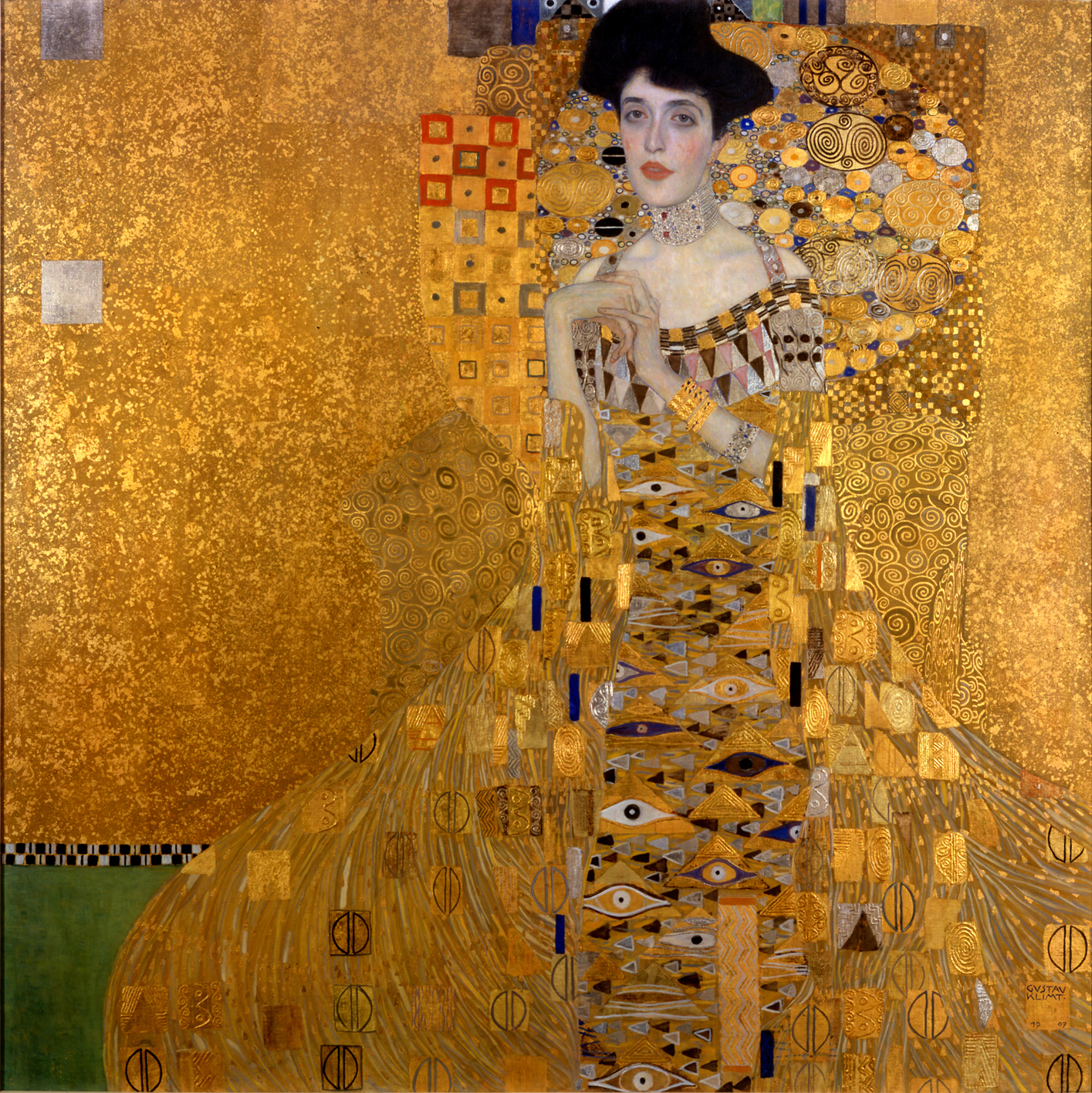 |
| Fig 2- Gustav Klimt, Portrait of Adele Bloch-Bauer I, 1907 |
Figure 2 is a great example of the way Klimt communicates the wealth and luxury of the era he lived in. The textured gold background allows the richly patterned robes of the subject to take attention, whereas the pallid grey-blue skin of the focus competes with this and draws your eyes there first. Strangely enough, the fact that the robes are so detailed and the face so plain causes the viewer to instead focus on the face first, while the jewel tones present throughout the whole of the piece add little elements of interest throughout, rather than it just being one constant colour and texture.
In my own work, I often try to use colour to symbolise certain things. Most importantly I take into account the colour as a whole, and what effect it has on the entire mood of the piece.


Figure 3 is the image I recently made for one of our briefs. The overall mood of the image is kind of tense in a storybook way; there's nothing too scary or creepy about it and the soft pastels used to describe Carrie's clothes help keep the image child-friendly. The browns I used for the forest branches are a friendly, warm brown, not sinister or malevolent like I would have done for a horror movie poster.
Then take Figure 4 into account; a simple colour change has drastically altered the atmosphere of the image, turning it into a eerily macabre depiction of some spooky conjuring. The jagged border looks sharp and painful, while the forest background is much more ethereal. Carrie herself has the pale blue skin of a recently-dead corpse, and stands out as a ghostly apparition rather than the apprehensive girl she is supposed to be.
The two extremes of this image show just how much colour can affect the way an image is interpreted; certain colours reflect certain values and associations, and this perception of those colours can change the whole meaning of an image.
[1] E. Anderson Feisner, Colour- How to Use Colour in Art and Design (second edition), London, Lawrence King Publishing, 2006, p2
Figure 1- Henri Matisse, The Red Studio, 1911, E. Anderson Feisner, Colour- How to Use Colour in Art and Design (second edition), London, Lawrence King Publishing, 2006, p2
Figure 2- Gustav Klimt, Portrait of Adele Bloch-Bauer I, 1907, N. Harris, The Life and Works of Gustav Klimt, London, Paragon, 2002, p57
No comments:
Post a Comment