Showing posts with label visual culture. Show all posts

Sunday, 16 March 2014

End of the 20th Century

Task

Research the work of graphic designers in contemporary music graphic design and/or lifestyle magazines and branding. 

In this task I am researching the work of designers in music, especially in the UK, following the Punk movement.

In the 1970s the British economy was failing. Young people at the time wanted to rebel against the government and this started to come through in their music. They aimed to shock and had a very strong DIY ethic, with other views including not 'selling out', non-conforming, anti-authoritarianism and individual freedom.

Punk rock was a slipshod music style, consisting of small bands usually with a lead vocalist, one or two electric guitarists, an electric bassist and a drummer. Often the instrumentalists in the band would provide back up vocals in the form of shouts and chants. Punk rock songs are usually short, just a few minutes long, comprising of maybe three or four chords loosely strung together.

Figure 1, Never Mind the Bollocks, Jamie Reed, 1977
Punk's DIY attitude also influenced the album and music art of the movement. In fanzines, torn out letters and scraps of cuttings from newspapers and other designs were recycled and used in them. Collage and photomontage was popular, and this album cover above by Jamie Reid for the Sex Pistols (Figure 1) was one of the most popular and influential of the Punk albums.

The Sex Pistols logo actually came about by accident- according to Malcolm McLaren anyway. While living with a friend called Helen Wellington Lloyd, he was producing leaflets to promote the band, and she would help him with them.
"She used to smoke a lot of dope, and she'd just get so spliffed up that she couldn't be bothered to go to the shops and buy Letraset, so she decided to cut out newspaper letters instead and make the band's name look like a ransom note. It just goes to show the best ideas are not alwyas conciously formed. It fitted the anti-commercial attitude of the band perfectly." 1
However the designer Jamie Reid contested this. In his version of events, the logo was achieved by a lack of money; the visuals had to be cheap and fast, and collaged type was the best way of doing this.
"At the time, we had to produce cheap (no money), fast, and effective visuals, so collage was the dominant look; things cut out from papers and magazines- photos and lettering- which was the so-called 'blackmail punk' look, which looked great." 2
Malcolm Garrett who designed many of the Buzzcocks album designs also incorporated a lot of collage into his works. He was directly influenced by Russian Constructivism posters, and especially by the work of El Lizzitsky, who worked with geometric shapes and triangles combined with straight lines and dramatic forms.
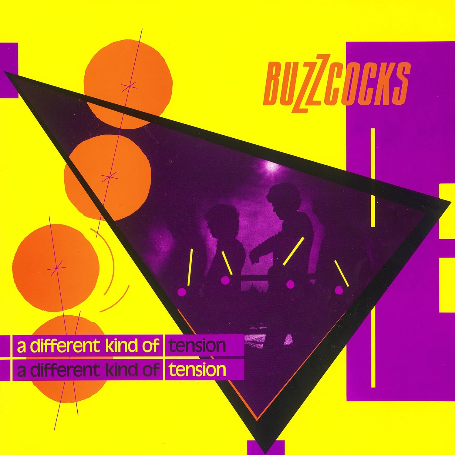
Figure 2, A Different Kind of Tension, Malcolm Garrett, 1979
Garish, clashing colours have been used, just like in the day-glo bright sleeve of Never Mind the Bollocks (Figure 2). Designers were experimenting more with colour at this time, using uncomfortable colour combinations which in theory should have been disastrous but in practice suited the message and ethics of the bands- loud, in your face, and not going anywhere soon. 

Figure 3, Movement, Peter Saville, 1981
Of all the contemporary graphic designers, Peter Saville is definitely one of the best known. Producing album covers for Joy Divison and New Order, he gained rapid popularity in the music world.

His album covers were sleek and sophisticated, communicating a much more mature and adult message than the raw punk albums. In the above New Order album design (Figure 3), in contrast to both the Sex Pistols and Buzzcocks, it uses harmonious colours which are unnoffensive to the eye and a simple but well thought-out design, and the streamlined design of the below Joy Divison cover also shows this (Figure 4). 

Figure 4, Unknown Pleasures, Peter Saville and Joy Division, 1979
"During this period, while the rest of the general design palette turned Day-Glo, Saville's own tastes veered more toward the classical." 3


List of Illustrations

Figure 1, Never Mind the Bollocks, Jamie Reed, 1977, THORGESON, S. & POWELL, A. 100 Best Album Covers, Dorling Kindersly, 1999, p.p. 106-107
Figure 2, A Different Kind of Tension, Malcolm Garrett, 1979, THORGESON, S. & POWELL, A. 100 Best Album Covers, Dorling Kindersly, 1999, p. 47
Figure 3, Movement, Peter Saville, 1981, KING, E. & YORK, P. Designed By Saville, Freize Publishing, p. 69
Figure 4, Unknown Pleasures, Peter Saville and Joy Division, 1979, KING, E. & YORK, P. Designed By Saville, Freize Publishing, p. 129

References

[1] THORGESON, S. & POWELL, A. 100 Best Album Covers, p. 106
[2] THORGESON, S. & POWELL, A. 100 Best Album Covers, p. 107

[3] KING, E. & YORK, P. Designed by Saville, p. 13

Bibliography

KING, E. & YORK, P. Designed by Saville, (2003) Freize. London
THORGESON, S. & POWELL, A. 100 Best Album Covers, (1999) Dorling Kindersly. London

Thursday, 27 February 2014

The 1960s

Task

Research Pop Art

In this task I am researching American Pop Art, focusing on Roy Litchenstein and Andy Warhol in particular. To me, these are two of the most well-known artists in American Pop Art and so I wanted to learn about them in more depth.

Pop culture became closely interwined with lifestyle in the 60s, especially in the USA. Consumerism was just reaching its first peak after the Second World War and artists reacted to this with Pop Art- employing aspects of mass culture such as advertising and comic book art and mundane everyday objects (think Warhol's soup cans). Because of the way artists would use found objects and images, the movement was similar to Dada art, and although the concepts behind each were different, there were similarities in the attitudes of the artists.

"What was it which made Dada so inspiring for the development of Pop Art? Dada combined advertising images and texts, slogans, revolutionary pamphlets, folk art and popular culture in collages, pictures with texts, photos, films... The unorthodox, and in some ways surreal, manner in which it combined these, integrating both the rational ordering principle and elements of chance, influenced Pop Art and the Happening towards the end of the fifties." 1

After struggling to secure a one-man show in his name, Andy Warhol finally managed to get an exhibition in place after painting a series of dollar bills which Eleanor Ward challenged him to create.

"As Warhol remembers it, the three of them met and, after De had asked her point-blank if she was going to take Warhol on, "She took out her wallet and looked through the bill compartment. Then she held up a two dollar bill and said, 'Andy, if you paint me this, I'll give you a show.'" 2
The reaction to this first show of his was immense, and the Manhattan art world loved it. Andy Warhol was famous.

Figure 1, Two Dollar Bills (Front and Rear), Andy Warhol, 1962

Following this came his images of Monroe and Elvis- the constantly repeated images of their faces on garish backgrounds in block colours dehumanised them, and reveal the inauthenticity of their characters. Warhol has transformed them into a series of meaningless pictures, transfering them onto the canvas in an almost careless way, making her marketable persona something very alien and unpredictable.
"Critics would choose to see Warhol as a social commentator, a painter using the devices of commercial art to expose the mediocrity and exploitiveness of popular culture... It must be understood, though, that Warhol likes best those whose images shine the brightest- better yet, those who are images. Warhol likes stars." 3
Figure 2, Red Elvis, Andy Warhol, 1962

In comparison to Warhol's bold, brash and quite inelegant works, Roy Lichtenstein's are well-finished, and underneath their content offer a sophisticated variant on typical Western modernism. He used comic strips as his main inspiration, although he was also inspired by popular advertising, and his works often had themes of humour and parody in them. His style was typically bold, thick lines, along with the prominence of Ben-Day dots (imitating printing techniques at the time), again inspired by comic strips.
 
Figure 3, Drowning Girl, Roy Lichtenstein, 1963

Lichtenstein wanted his images to look machine made, although deep down he was always a painter, and unlike Warhol, he almost never used or took photography as a base for his work. His works always retained a sense of traditional methods, no matter how hard he tried to make them look machine made. He preferred to use hand-drawn figures from anonymous artists that held no particular interest or value to them.
"Tension is created between the look of an anonymous drawing style and the knowledge that an individual artist did actually execute a commercial image. A remainder of the human hand remains inherent to the drawing process itself, however impersonal it may seem." 4

List of Illustrations

Figure 1 Two Dollar Bills (Front and Rear), Andy Warhol, 1962, OSTERWOLD, T. Pop Art, Taschen, 2003, p.132
Figure 2 Red Elvis, Andy Warhol, 1962, RATCLIFF, C. Warhol, Cross River Press, 1983, p.28
Figure 3 Drowning Girl, Roy Lichtenstein, 1963, HENDRICKSON, J. Lichtenstein, Taschen, 1993, p. 31

References

[1] OSTERWOLD, T. Pop Art, p. 136
[2] RATCLIFF, C. Warhol, p.26
[3] RATCLIFF, C. Warhol, p.28
[4] HENDRICKSON, J. Lichtenstein, p.25

Bibliography

HENDRICKSON, J. Lichtenstin, (1993), Taschen. London
OSTERWOLD, T. Pop Art, (2003), Taschen, London
RATCLIFF, C. Warhol, (1983), Cross River Press

Monday, 24 February 2014

The 1940s and 1950s

Task

Research illustration, graphics and posters in the second World War.

In this research task I am focusing on the posters and graphics in Britain during WWII. I chose the posters in Britain specifically because I always loved the 'Dig For Victory' slogan and its meaning, especially at school when learning about the War and England during that time.

In the WWII propoganda posters throughout Britan, the general message was that 'work will bring victory'. People were encouraged to grow their own foodstuffs and be careful of their use of rationing, due to limited trading. There was also a lot of gender-specific posters, aimed at women who remained at home, encouraging them to work in the fields or factories (in the place of men), and to be content sending their children away for evacuation during the Blitz.

Figure 1, Dig For Victory, Unknown, 1941
This poster became the signature of the 'Dig for Victory' movement throughout the War, and after this initial use, the slogan was used in many other poster formats during the War. The hugely bold sanserif text is really in your face and reads much like the title of an epic movie. The vibrant red colour combined with the black and white contrast of the photograph is eye-catching and would have added to the attractiveness of the poster, capable of capturing the nation's eye perfectly.
"The importance of self-sufficiency was emphasised- with a note of wry humour- in bestowing epic grandeur to the mundane task of kitchen gardening." 1
Figure 1, Grow Your own Food, Abram Games, 1942
This was another poster reinforcing home cultivation of crops and other foods. The symbolism in this poster is strong, with the obvious trowel and shovel transforming into a knife and fork at the table end, showing the importance of putting your own food on your own table. Again the type is large and bold, contrasting with the lighter coloured background. This, again, would have caught people's eye and was an effective way of advertising.

Figure 3, Women of Britain Come into the Factories, Philip Zec, 1941
When conscription took place in Britain, there were hardly any men available to fill the spaces in the workplace they previously held. Thus, women were the country's port of call, and so a new perspective on advertising around women was needed. The above poster encouraging women to seek work in factories was a far cry from previous propoganda put out by the government- posters about women were usually extremely sexist and sterotypical, especially in 'anti-gossip material' burnished with the phrase 'careless talk costs lives'. In these posters, women were usually the focus of the image, adhering to the stereotype that all women are silly gossips and should be told repeatedly to 'keep mum'. 
"The National Service Act in December 1941- obliging all unmarried women under 30 to join the forces or enter war production- also demanded fresh perspectives in British propoganda. The hackneyed depictions of feminine vulnerability of earlier posters gave way to recruiting images of women exhibiting traditonally masculine virtues of confidence and determination, befitting the male domains they were entering." 2
A constant feature throughout most of the posters and propoganda of this time is the prominence of the text. Wether sanserif or serif, the text is almost always in an obvious, eye catching position, of a solid, contrasting colour and featuring powerful language relating to the content.


List of Illustrations

Figure 1 Dig For Victory, Unknown, 1941, SLOCOMBE, R. British Posters of the Second World War, Imperial War Museum, 2012, p.34
Figure 2 Grow Your own Food, Abram Games, 1942, SLOCOMBE, R. British Posters of the Second World War, Imperial War Museum, 2012, p.37
Figure 3 Women of Britain Come into the Factories, Philip Zec, 1941, SLOCOMBE, R. British Posters of the Second World War, Imperial War Museum, 2012, p.16

References

[1] SLOCOMBE, R. British Posters of the Second World War, p.34
[2] SLOCOMBE, R. British Posters of the Second World War, p.16

Bibliography

SLOCOMBE, R. British Posters of the Second World War, (2012), Imperial War Museum

Sunday, 23 February 2014

1930s

Task

Analyse three key Art Deco posters looking at political or commercial context and stylistic influences of illustration or typography. 

The 1930's in the USA were a decade of glamour and high class. However it was also a time of extreme economic difficulty after the Wall Street Crash and the beginning of the Great Depression.

Art Deco was influenced by a number of things- cubism and constructivism were two sources, along with Bauhaus modernism and even ancient Egyptian and Aztec designs. Art Deco featured powerful imagery and strikingly bold lines and colour, combined with a penchant for the masculine power of new machinery and tecnhology.
"The Art Deco poster artist took inspiration from many of the movements in avant-garde painting of the early years of the century. Cubism and Futurism, in particular, provided powerful new advertising tools. Cubism added fragmentation; abstraction and overlapping images and colour. Futurism contributed the new century's preoccupation with speed and power, translated brilliantly by poster artists into potent images of the era's new giant oceanliners and express locomotives." 1
 Advertisement for transport, especially transatlantic travel, was huge. In the Art Nouveau era, poster advertisements tended to be limited to theatre and music shows, however this all changed with the emergence of new up-and-coming graphic designers such as Cassandre, one of the biggest artists of the time. He produced a number of iconic travel posters, an embodiment of the Art Deco movement.


Figure 1, Normandie Poster, Cassandre, 1935
The above poster for the Normandie liner was one of the most iconic of all Art Deco posters. New and improved manufacturing techniques created a huge surplus of products which meant that design became an important medium to persuade consumers to buy or use a particular product. Designs were simplified, which is obvious in the Normandie poster in that its simple symmetry is a powerul symbol. A limited range of colours are used and the type is bold and masculine, speaking volumes about the immense power of this new transatlantic liner, the fastest ship of the day, a French product that was an Art Deco tour de force in itself due to the pure artistic interior design by Jean Dunand, one of the most gifted interior designers of the time.
"Sharp linear compositions, floating on flat areas of background colour, quickly drew the eye. Other gimmicks helped to gain attention, such as aerial and diagonal perspectives. New sanserif type faces streamlined the message." 2
This is clearly seen in the Normandie poster, and in many others of Cassandre's advertising work. The wealth and luxury of the time lent itself to the travel industry, which is why the advertisement of travel was so popular and important.

Figure 2, Nord Express, Cassandre, 1927

Above is an earlier travel advertisement poster by Cassandre for the Nord Express, a new transcontinental railway. Again it shows the same power and elegance of the Normandie poster, and shows the diagonal perspective typical of Art Deco poster design at the time. Cassandre used a sleek sanserif type, another modern element of design, and the poster emphasised the importance of this new train which was the pride of its company.
"As with most regional railway companies, its star locomotive, in this case the Nord Express, was the flagship for the company, emphasizing its speed and transcontinental credentials." 3
Another area where graphic and poster design was evolving was in fashion. Vogue magazine began in the late nineteenth century but it was due to the publisher Condé Nast that it became one of the most read fashion journals both in Europe and America.

Figure 3, The Wedding March, cover of Vogue, March 1929, Georges Lepape
Here in the March 1929 edition of Vogue magazine, there are all the elements of high fashion and extreme wealth displayed in the design. The colours of red and gold are historically regarded as royal colours, signifying prosperity and regality along with elegance and, again, wealth. The symmetrical composition of the design is also a staple of the graphic design in this era, a powerful, bold layout exuding fashion and fortune. Even in the Great Depression Vogue was popular, with sales rising as the public sought to escape their own dismal realities.

"Even though America and Europe were entering the period known as the Great Depression, sales of Vogue increased dramatically as people sought refuge from the traumas of their own existence, finding solace in fashion and celebrity." 4

List of Illustrations

Figure 1 Normandie Poster, Cassandre, 1935, ROBINSON, M. & ORMISTON, R. Art Deco: The Golden Age of Graphic Art and Illustration, 2013, Flame Tree Publishing, p.145
Figure 2 Nord Express Poster, Cassandre, 1927, ROBINSON, M. & ORMISTON, R. Art Deco: The Golden Age of Graphic Art and Illustration, 2013, Flame Tree Publishing, p.140
Figure 3 The Wedding March, Georges Lepape, Vogue, March 1929, ROBINSON, M. & ORMISTON, R. Art Deco: The Golden Age of Graphic Art and Illustration, 2013, Flame Tree Publishing, p.141

References

[1] DUNCAN, A. Art Deco, p.p. 150-151
[2] DUNCAN, A. Art Deco, p. 150
[3] ROBINSON, M. & ORMISTON, R. Art Deco: The Golden Age of Graphics and Illustration, p. 141
[4] ROBINSON, M. & ORMISTON, R. Art Deco: The Golden Age of Graphics and Illustration, p. 126

Bibliography

DUNCAN, A. Art Deco, (1988), Thames and Hudson, London
ROBINSON, M. & ORMISTON, R. Art Deco: The Golden Age of Graphics and Illustration, (2013), Flame Tree Publishing, London

Friday, 21 February 2014

1920's Europe and Russia

Task

Research surrealism and sexuality in 1920's art, photography and film.

After the Dada art following the first World War, realism went out the window. The movement started in Paris (the center of Surrealism) and from the 1920's it spread across the globe.

The art of surrealism featured a lot of sexual connotations, with basic human fears, motivations and instincts being the focus. These emotions and desires were almost animalistic and these were the parts of the brain these artists were trying to access.

"Eroticism is the force majeure that drives Surrealism. It is the great liberating power. It is always present, wether overt of hidden- a constant sourse of disturbance..." 1

One of the most well-known and popular artists of the surrealist art movement was Salvador Dali, a Spanish artist born in 1904. Towards the late 1920s Dali had fully embraced Surrealism and his works were focused on his own sexual fears and eroticism.

Figure 1, The Great Masturbator, Salavador Dali, 1929
This was one of Dali's earliest surrealist paintings. It was an expression of his anxiety, again related to his sexual fears, especially of women and their sexuality.
"Dalí himself described it as "the expression of my heterosexual anxiety". In 1929 he was still a virgin, inhibited by deep-seated fears of female sexuality and anal obsessions." 2
Dali also made a film along with director Luis Bunuel, Un Chien Andalou (An Andalusian Dog). It was a hit when released, being shown for over 8 months, and uses dream logic and a disjointed timeline to further the surreal experience. It was based on supressed human emotions, featuring scenes from dreams of Dali and Bunuel, including a moon sliced through by a cloud 'like an eye with a razor'.

Figure 2, A still from Un Chien  Andalou showing a woman's eye being sliced open.

One of the biggest surrealist photohraphers of the time was Man Ray, who was introduced to surrealism by artists of the Dada such as Marcel Duchamp and Jean Cocteau. The women in his life were usually the subjects in his work, and he showed them off to the world whereas most artists would rather have kept their sexual partners to themselves.

Figure 3, Violon d'Ingres, Man Ray, 1924
In Paris Man Ray met one of his most prominent muses, Kiki de Montparnasse, and the images she inspired him to create were possibly the most openly erotic ever produced. Violon d'Ingres is probably the most famous, and the title is a mischievous play on words, with the 'f' shaped violin holes adding the famous final touch.
"The woman's back is in itself an instrument, and one that the skilled player (the lover) can coax into life with his (or her) hands. ... Ray formed a link between "two distant realities", a game the Surrealists loves to play. The suggestive title implies that, by transforming his model into an object, Kiki has become a toy or plaything for Man Ray..." 3
This is again an example of the prominent sexual themes in Surrealism, prevalent throughout both the photography and art of the movement, while the film produced in this era had obvious themes in the human subconcious and dream logic.

List of Illustrations

Figure 1 The Great Masturbator, Salavador Dali, 1929, HARRIS, N. The Life and Works of Dali, Parragon, 2002, p. 15
Figure 2 Un Chien Andalou, Salvador Dali & Luis Bunuel, 1929, http://en.wikipedia.org/wiki/Un_Chien_Andalou , 21/02/14
Figure 3 Violon d'Ingres, Man Ray, 1924, Man Ray, Grange Books, 2005, p.15

References

[1] BOUQUERET, C. Surrealist Photography, p. 4
[2] HARRIS, N. The Life and Works of Dali, p. 15
[3] Not Stated, Man Ray, p. 27

Bibliography

BOUQUERET, C. Surrealist Photography, (2007) Thames and Hudson, London
HARRIS, N. The Life and Works of Dali, (2002) Parragon Publishing, London
Not Stated, Man Ray, (2005) Grange Books, London

Thursday, 20 February 2014

1900-1920

Task

Research Art of the First World War and its Aftermath

In this research post I will be focusing on the Cubist works of Picasso and Dadaism after the Great War.

The turn of the century was a celebration for all but was shortly followed by the First World War. WWI came about after a series of political clashes between the Great Powers, including England, Germany, France, Russia, Italy and Austria-Hungary.

Traditional methods of painting in this time changed; artists began to change their attitudes and beliefs towards their art, and instead of the previously very realist artistic style, more abtract images and conceptual methods began to take form, and 'Modern Art' was born.

Figure 1, Les Demoiselles d'Avignon, 1907, Pablo Picasso
This early painting of Picasso's was one of his most important and revolutionary images. Influenced heavily by Iberian art and African masks and culture, this painting of 5 women from a brothel launched an artistic protest against the Western visual norm.
"Western visual conventions- accurate perspective and a single viewpoint- are violated, for example in the seated woman on the right, seen simultaneously full-face and from behind. The faces of the central figures reflect Picasso's interest in ancient Iberian art; the rest have mask-heads directly inspired by the African sculptures which Picasso has seen in Paris's Musée de l'Homme." 1
This painting was also a suggestion of early cubism. The forms have almost faceted surfaces, and there is a geometric emphasis throughout the piece with lots of sharp angles and hard, straight lines.

Picasso's Cubism focused mainly on figure paintings, although he also did sculptures and landscape studies too. A lot of his figure work was almost monochromatic, with dark tones used such as greys and blacks with burgundy and brown, as seen in the next two figures.

Figure 2, Portrait of Ambroise Vollard, 1909-10, Pablo Picasso

Figure 3, Woman in an Armchair, 1910, Pablo Picasso

Cubism during the War was different. It evolved into Futurism, a hard edged movement which emphasised and glorified the future as it was seen at the time, focusing on contemporary concepts such as extreme speed and technology, cars and aeroplanes and industrial cities.

Figure 4, Abstract Speed and Sound, 1913-14, Giacomo Balla

As you can see, there are still relations between this Futurist piece and Picasso's Cubism. There are still many geometric lines and angles encorporated in the piece, meaning to describe the speed and power of a moving automobile, although there are more adventurous colours involved in this piece.

Dada 'art' was motivated by a series of psychological and artistic themes following the First World War, and involved painting, sculpture, literature, performing arts and much much more. Dada had no real reason or logic to it and was supposed to be an 'anti-art' movement.

Marcel Duchamp was an artist who tried to remain unaffiliated with the Dada movement but was one of the biggest contributors to conceptual art and 'freeing of the mind' after the Great War.

"Its central figure, Marcel Duchamp, had little use for the label, although his scandalous readymade urinal and his habit of cross-dressing as Rrose Sélavy have become the key examples of dada provocation." 2

List of Illustrations

Figure 1 Les Demoiselles d'Avignon, 1907, Pablo Picasso, HARRIS, N. The Life and Works of Picasso, 2002, p. 21
Figure 2 Portrait of Ambroise Vollard, 1909-10, Pablo Picasso, HARRIS, N. The Life and Works of Picasso, 2002, p. 28
Figure 3 Woman in an Armchair, 1910, Pablo Picasso, COX, N. Cubism, 2000, p. 12
Figure 4 Abstract Speed and Sound, 1913-14, Giacomo Balla, http://www.ranker.com/list/futurism-paintings/reference, 20/02/14

References

[1] HARRIS, N. The Life and Works of Picasso, p. 21
[2] KUENZLI, R. DADA, p. 22

Bibliography

COX, N. Cubism, (2002), Phaidon Press Limited, London
HARRIS, N. The Life and Works of Picasso, (2002), Parragon Books, London
KUENZLI, R. DADA, (2006), Phaidon Press Limited, London

Wednesday, 19 February 2014

Late 19th Century

Task:

Research examples of Art Nouveau in illustration and graphics.

Art Nouveau originated in France, and means 'New Art'. In this research task I will concentrate on the commercial works of Alphonse Mucha, who is probably the most well-known artist of this movement, having designed hundreds of posters and advertisements as well as furniture and jewelery designs.

Figure 1, Gismonda poster, Mucha 1898

This poster was created for Sarah Bernhardt, a famous theatre actress at the time, and was the image that launched Mucha to fame. It was so different to anything else in that era that at first it was coined a disaster by the printers, who proclaimed no-one would ever like it. However when presented to Sarah, she immediately loved it.

"The actress was examining the poster which she had hung on the wall. She turned around and kissed him, initiating a collaboration which lasted for six years.                              Alphonse Mucha was catapulted into the international art world almost overnight. Witnesses to his success were all astonished by the unusual chain of events that had permitted an obscure graphic artist- known before to only a few professionals- to receive the sublime kiss of recognition in Sarah's dressing room." 1
The poster was greeted by the public with just as much enthusiasm as Sarah and she personified the style- the style swept through Europe, not only in graphic form but in interior decor and even architecture. The style had roots in a number of influences, ranging from Japonisme and oriental art to the elaborate French Rococo.

Figure 2, The Geisha Itsutomi, Eishi
This is an example of typical Japonisme. Note the similarities between the styles- especially in regards to the asymmetry of the piece and the long flowing dress the woman is wearing. Japanese woodblock printing also influenced the Art Nouveau style, in the form of solid contoured lines and gradient backgrounds. Two of the most popular and famous Japanese woodblock artists were Hokusai and Hiroshige. 

Figure 3, The Great Wave off Kanagawa, Hokusai
The Great Wave off Kanagawa by Hokusai is possibly one of Japan's most famous artworks. When compared with Mucha's illustration poster La Trappistine, you can see the direct influence in the form of the gradiented background and smooth flowing lines, along with the curvature of the lines and their precise purposefullness. 

Figure 4, La Trappistine, Mucha, 1897


Art Nouveau also went under another name for a while- 'Le Style Mucha'. This was because Mucha was the embodiment of the style- his works became so famous and widespread he was THE artist to commission for Art Nouveau.

One of the main features of Art Nouveau, or Le Style Mucha, was the prominent features of flowers, jewels and other decorative objects in the posters and designs. The illustrations also usually featured a frame of some sort, wether it be circular or rectangular or a swirling motif around the image. The colours used were usually soft pastel tones, a far cry from the bright and gaudy primary colours used elsewhere in this period.  

"There was hardly any text and a profusion of pale colours; it was the exact opposite of current poster art. The elongated shape of the poster and pastel colours - pale whites, cream and beige with subtle mauves, reds, and greens - were so at odds with the current trend of square-shape or landscape posters in bright primary colours." 2

List of Illustrations

Figure 1 Gismonda poster, Mucha, 1898, ELLRIDGE, A. Mucha: The Triumph of Art Nouveau, Paris, 2001, p. 44
Figure 2 The Geisha Itsutomi, Selected Geisha of the Gay Quarter, Eishi, http://lifestyle.inquirer.net/117001/utamaro-and-his-six-women 19/02/14
Figure 3 The Great Wave off Kanagawa, Thirty-Six Views of Mount Fuji, Hokusai, http://commons.wikimedia.org/wiki/File:The_Great_Wave_off_Kanagawa.jpg 19/02/14
Figure 4 La Trappistine, Mucha, 1897, ORMISTON, R. Alphonse Mucha: Masterworks, 2007, p. 53

References

[1] ELLRIDGE, A. Mucha: The Triumph of Art Nouveau, p. 44
[2] ORMISTON, R. Alphonse Mucha: Masterworks, p. 94

Bibliography

ELLRIDGE, A. Mucha: The Triumph of Art Nouveau, (2001) Terrail, Paris
ORMISTON, R. Alphonse Mucha: Masterworks, (2007) Flame Tree Publishing, London


Tuesday, 11 February 2014

The Renaissance in Europe

Task:

Research an artist from the Renaissance in Europe.

The artist I chose to focus my research on in this topic is Hieronymus Bosch.

Bosch's life is a bit ambigious because there were no clear records of his birth, although his death was confirmed in 1516 in a registry of names from his hometown of Hertogenbosch, a small town near the Dutch/ German border. However he is assumed to have been born around 1450 because of a portrait by an anonymous artist in red and black chalk.

"His birth date was not found, but because his portrait, which was discovered in the Arras Codex, showed a man of about sixty, his birth was assumed to have been around 1450. There are a few references to Bosch between these dates in the archives of the Brotherhood of Our Lady's at Hertogenbosch." 1

Figure 1, Red and black chalk portrait of Bosch

His paintings throughout his life were oddities of the period as they focused around themes of death, apocalypse and mortal sin. The works were also often in triptych format, a series of three paintings together to make one whole. This made it easier to tell the 'story' of his paintings, or rather separate the different elements of the images such as Paradise, The Garden and Hell in his painting 'The Garden of Earthly Delights'.

Figure 2, The Garden of Earthly Delights, Hieronymus Bosch, 1503-1504
 Bosch's paintings also featured many surreal elements, and monsters and people that were personifications of evil and/or sin, and would paint them with such conviction and skill it was possible to believe in them. This in turn influenced many future artists, especially ones such as Salvador Dali within the 20th century.

"He would make his creatures, their activities, and their environments as wierd and unwordly as possible, yet, the painter would make these things believeable by rendering them with all of the technical mastery an artist would ordinarily use to produce the illusion of the natural world." 2

List of Illustrations

Figure 1 Hieronymus Bosch, Anonymous, unknown, Grange Books, 2005, p. 18
Figure 2 The Garden of Earthly Delights, Hieronymus Bosch, 1503-1504, Grange Books, 2005, p. 26

References

[1] Not Stated, Hieronymus Bosch, Grange Books, 2005, p. 18
[2] Not Stated, Hieronymus Bosch, Grange Books, 2005, p.72

Bibliography

Not Stated, Hieronymus Bosch, (2005), Grange Books, London