Tuesday, 25 November 2014

Week 6- Symbolism and Colour in Modern Illustration

Research how the use of colour can influence the interpretation of an illustration.

Color defines our world and our emotions. It is usually seen before imagery. Our eyes are attracted to color to such an extent that the color of an object is perceived before the details imparted by its shapes and lines. [1]
Colour is possibly one of the most important factors to consider within art and design. The use of colour can totally alter the perception of a piece of work, wether for good or bad, and most images work best when the colours used allow the viewer to 'see' the image as a whole.

Fig 1- Henri Matisse, The Red Studio, 1911
An example of how colour can be seen before imagery is shown above, in Figure 1. This painting by Matisse uses an overabundance of red, and at first glance it's what makes the initial impression of the piece, and it requires another look to identify the other objects in the image.

Colour can influence the temperature, atmosphere and symbolism of an image. For example, Gustav Klimt was a master of communicating tones of wealth and luxury through his work, via the use of rich gold hues and blacks and whites to contrast.
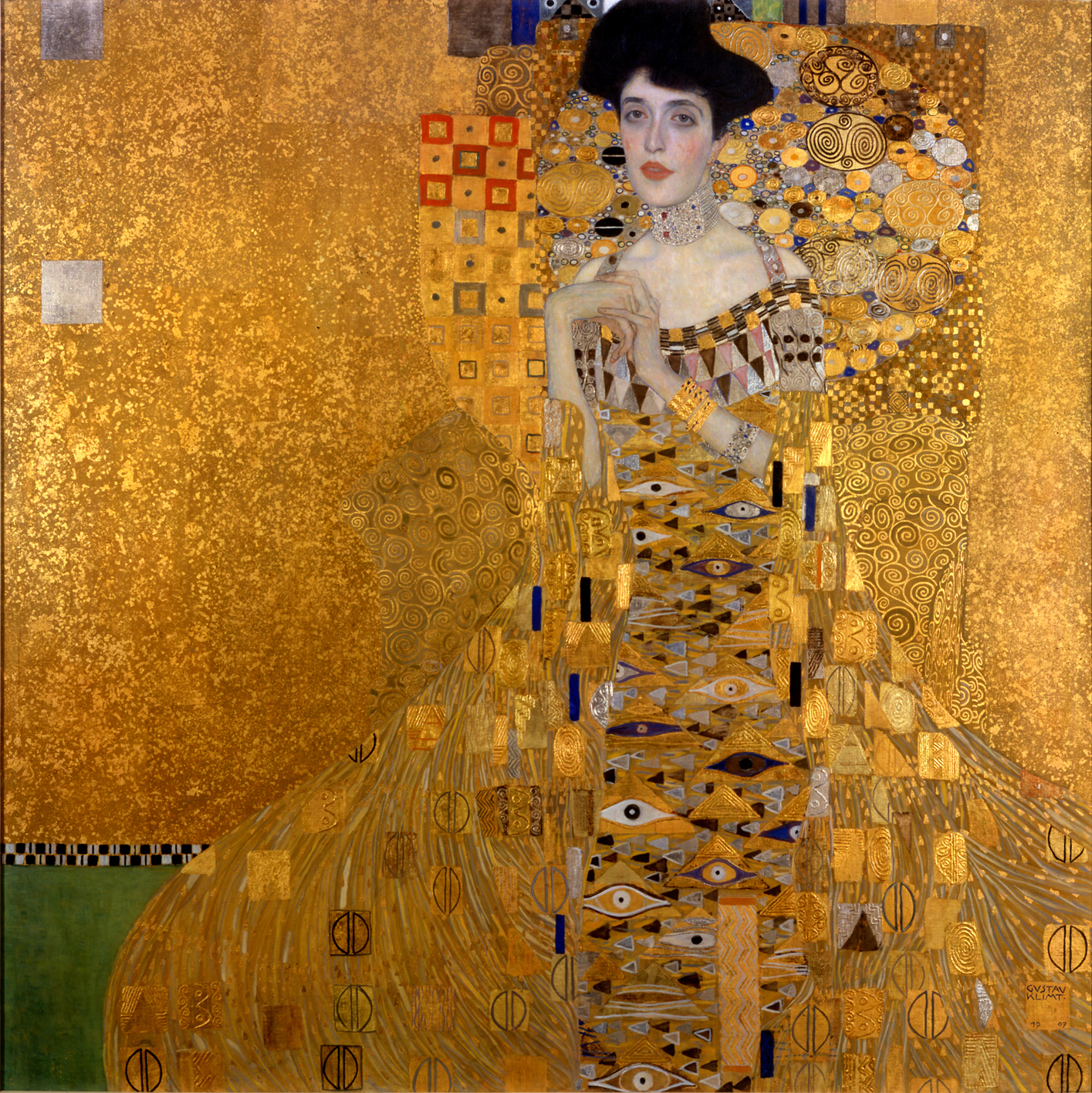
Fig 2- Gustav Klimt, Portrait of Adele Bloch-Bauer I, 1907

Figure 2 is a great example of the way Klimt communicates the wealth and luxury of the era he lived in. The textured gold background allows the richly patterned robes of the subject to take attention, whereas the pallid grey-blue skin of the focus competes with this and draws your eyes there first. Strangely enough, the fact that the robes are so detailed and the face so plain causes the viewer to instead focus on the face first, while the jewel tones present throughout the whole of the piece add little elements of interest throughout, rather than it just being one constant colour and texture.

In my own work, I often try to use colour to symbolise certain things. Most importantly I take into account the colour as a whole, and what effect it has on the entire mood of the piece.

                                  Figure 3 & 4, Sophie Babur-Puplett, Carrie's War, 2015

Figure 3 is the image I recently made for one of our briefs. The overall mood of the image is kind of tense in a storybook way; there's nothing too scary or creepy about it and the soft pastels used to describe Carrie's clothes help keep the image child-friendly. The browns I used for the forest branches are a friendly, warm brown, not sinister or malevolent like I would have done for a horror movie poster.

Then take Figure 4 into account; a simple colour change has drastically altered the atmosphere of the image, turning it into a eerily macabre depiction of some spooky conjuring. The jagged border looks sharp and painful, while the forest background is much more ethereal. Carrie herself has the pale blue skin of a recently-dead corpse, and stands out as a ghostly apparition rather than the apprehensive girl she is supposed to be.

The two extremes of this image show just how much colour can affect the way an image is interpreted; certain colours reflect certain values and associations, and this perception of those colours can change the whole meaning of an image.


[1] E. Anderson Feisner, Colour- How to Use Colour in Art and Design (second edition), London, Lawrence King Publishing, 2006,  p2


Figure 1- Henri Matisse, The Red Studio, 1911, E. Anderson Feisner, Colour- How to Use Colour in Art and Design (second edition), London, Lawrence King Publishing, 2006,  p2
Figure 2- Gustav Klimt, Portrait of Adele Bloch-Bauer I1907, N. Harris, The Life and Works of Gustav Klimt, London, Paragon, 2002,  p57

Monday, 10 November 2014

Week 4- Illustration as Object

Research the illustrated products of Fredun Shapur.

Fredun Shapur was an illustrator largely popular throughout the 1960s-80s, and manufactured illustrated toys and games popular with children and adults alike. His works were mainly produced as wooden toys, with printed designs and patterns on them, although he is also known for the illustrated 'play sack' children could dress up in.

Fig. 1- Fredun Shapur, Playsacks
Fig. 2- Fredun Shapur, Placksacks 2
Shapur's Playsacks were the result of being a father- his daughter needed a costume for a play, and using only a kitchen refuse sack, he designed a fantastically creative and appealing pull over children of all ages could enjoy. Being made of paper was also an advantage, as of course after the war economically friendly products were needed while materials were scarcer. 

After the war, most children's toys in Britain were made with plastic or metal instead of the traditional materials such as wood and string. Shapur's primary canvas was wood- his jigsaws and puzzles fitted the form fantastically with their bright, blocky colours and images. Almost first and foremost in his design was the need to play; Shapur believed anybody, anywhere at any age could play, and his toys were designed to challenge and enthral children. The Animal Puzzles he created were a great example of this, and 'favoured high contrast and playful imagery'[1].

Fig. 3- Fredun Shapur, Animal Puzzles
Shortly after the Animal Puzzles came the Four Way Blocks. These were blocks that when lined up, showed a screen printed image of an animal, and when turned, revealed another on each side. 
"Turning and reordering the blocks slowly and magically reveals a different animal: a cat, an elephant, a snake, a horse." [2]
Fig. 4- Fredun Shapur, Four Way Blocks
His work also extended to illustration as we would usually know it, in books or as images. In each image he produced there was always the same playfulness as his toys, and of course the bold colours and simple forms were the basis for his illustrations. 

Nowadays it's extremely easy to find products with illustrative images on. Fashion retailers such as River Island and Topshop feature printed t-shirts, skirts and dresses among other things, and a lot of prints are typography or photography based, along with lots of illustrative patterns. 

Fig. 5- Topshop 'Sketch' Illustrated Dress
The above dress features a dress with an illustrated pattern, described as a 'sketch' pattern. This sort of pattern could be applied to almost anything, i.e. t-shirts and skirts and even on things such as wallpaper. Prints like this are very versatile and if picked up by a major retailer could be a good source of income. 

Fig. 6- River Island 'Santa Claws' T-Shirt
This t-shirt from River Island shows what looks to be an ink or paint illustration of a cat wearing a leopard print Santa hat. This print is also rather versatile and could be printed on cushions or cards, on it's own as art or onto a tote bag. There are limitations to prints like this though, as anything from clothing style to background colour would affect the appeal of the piece and it would need to be tested carefully to ensure an attractive product.

In my own work I do get ideas from time to time of good products my own illustrations could be applied to. An example of this is my watercolour 'Chicken and Egg' drawing which was exhibited in the Coningsby Gallery earlier this year.

Fig. 7- Me, Chicken, 2014

I think my chicken would look great on cushions, tea towels, aprons, bags... The exact product I would choose for this illustration would be limited to which demographic I was targeting but with research this would be easy to define. Animal illustrations are hugely popular in mass culture today and feature on anything from phone cases to blankets and pillows and even tights and underwear. The market for illustrated objects is massive today and the demand just keeps growing and expanding, accelerated by the use of social media and the Internet. It has never been so easy to make money from illustrations by using websites such as redbubble.com and printalloverme.com, which are websites where you can apply your image to a product that they supply, manufacture and price and then take a commission from. Redbubble has a video to show prospective designers just how easy it is to get started.


[1] M. Shapur & A. F. Ogata, Fredun Shapur: Playing with Design, Paris, Editions Piqpoq, 2013, p14
[2] M. Shapur & A. F. Ogata, Fredun Shapur: Playing with Design, Paris, Editions Piqpoq, 2013, p25

Figure 1- Fredun Shapur, Playsacks, 1960s, M. Shapur & A. F. Ogata, Fredun Shapur: Playing with Design, Paris, Editions Piqpoq, 2013, p46
Figure 2- Fredun Shapur, Playsacks, 1960s, M. Shapur & A. F. Ogata, Fredun Shapur: Playing with Design, Paris, Editions Piqpoq, 2013, p49
Figure 3- Fredun Shapur, Animal Puzzles, 1960s, M. Shapur & A. F. Ogata, Fredun Shapur: Playing with Design, Paris, Editions Piqpoq, 2013, p22
Figure 4- Fredun Shapur, Four Way Blocks, 1960s, M. Shapur & A. F. Ogata, Fredun Shapur: Playing with Design, Paris, Editions Piqpoq, 2013, p25
Figure 5- Topshop 'Sketch' dress, taken from www.topshop.com , accessed 9/12/14
Figure 6- River Island 'Santa Claws' t-shirt, taken from www.riverisland.com , accessed 9/12/14
Figure 7- Sophie Babur Puplett, Chicken, 2013

Week 3- 50s and 60s Album Covers

Research the emergence of album covers and how they differ from modern pieces, including my own. 

Music has always played a part in popular culture, and after the war musicians became more and more popular within the public eye as the war children grew up and started searching for something more. The popularity of discos and dances helped speed up this process, along with the performance of live bands and acts. 

Thus it made sense that as these musical talents began gaining popularity, they would combine their best songs and shepherd them onto one record in the form of an album. Early album art was non existent- the first records were packaged in plain brown or white paper bags with holes cut to show the record label. However due to the records being stored upright, many broke in storage and so empty 'record albums' were produced so that people could store and view their records safely. 

Fig. 1. Sonny Rollins- A Night at the Village Vanguard, 1959

The earliest artworks of album covers were often rather simple. Frequently the image would just be of the artist or band, with a coloured background and some bold text over the top, like the example above. Blues artists were huge at the time and so a lot of early music covers featured these really African American men singing or playing music on the front, which caused some controversy within the industry as a lot of critics thought an attractive young girl on the cover would sell more than an unknown man, as stated below:
"They were sure that with these new artists they were introducing, so many of them were leaders for the first time, so maybe the public in Harlem knew about them, but across the country they didn't... and they felt it was very important to put these mens' photos as prominently as possible on the covers and they got a lot of flak from distributors across the country who felt a pretty girl would have been better." [1]
As time went on, designers got more and more creative and abstract with their ideas and this helped push the album cover as a real form of art. Typography often played a large part in the designs, even with more illustrative elements coming into play; some covers were composed entirely of type.

Fig. 2- Kenny Dorham- Trompeta Toccata
The above album does feature the artist, but the photo is small and slim at the top of an image dominated by type. Blues had already spread its influence to artists everywhere, shaping and moulding popular music forever. At this point in the 1960s, the Beatles were gaining popularity and went on to produce some of the most iconic music and album art of all time.

Fig. 3- The Beatles- Sgt. Peppers Lonely Hearts Club Band
This album cover used a mix of photography and what can only be described as a sculptural collage. The figures behind the band were all cut out cardboard figures, and the band are vibrant in comparison to them. The result was a very loud cover that screamed to be noticed, with lots of colour and detail, and it is now regarded as one of the best album covers of all time. This is in sharp contrast to the blues covers that were out less than a decade ago- the music industry was evolving rapidly and had the artwork to prove it.

Fig. 4- Blind Faith- Blind Faith
Just two years after Sgt. Pepper, Blind Faith released a self-titled album featuring a girl in a field holding a metallic aeroplane. Nothing controversial about that, right? Wrong. The girl in the image was topless, and the plane she posed with looked rather phallic in shape, pointing to the bottom of the image. In comparison to The Beatles albums, this was in your face in a way that most people at the time weren't used to. Even now, such blatant nudity would be hard-pressed to find its ways onto supermarket CD shelves, which is strange considering the other connotations within modern album art. In the US however, the record company wanted a different cover:
"In the US the record company were not happy with the cover, and at one point were even considering not releasing it. But Eric Clapton said, "No cover, no record." An alternative cover was made which featured a hand-bill from a concert that the group had played that summer in Hyde Park, but it wasn't used." [2]
In my own life, I don't think I've actually heard of an album with withheld artwork- perhaps you need to be more involved with music to know these things, or that it just doesn't happen now- maybe everything in popular culture is tailored to be non-offensive to the public. However there are definitely albums that challenge this and come as close as they can to total obscenity without crossing the line- an example of this is Nicki Minaj's Anaconda album.

Fig. 5- Nicki Minaj- Anaconda

The photo of Nicki is so obvious, I don't actually find it erotic or appealing. It's just there. I also don't find it offensive or vulgar, although that opinion is not shared by many and the cover art is considered controversial, but generally, nudity and sexualisation of pop icons is so common now that it doesn't really invoke the same outrage it would have 40 years ago. However this changes with certain demographics; this would be unlikely to appear on the shelves in Tesco due to the large amount of families that shop there. A 20 year old like me might not be bothered by it, but a mother with her 13 year son or daughter would most likely not approve because of the ways children can be affected by such imagery; a young female fan of hers might aspire to behave and dress in the same way, viewing her as a role model, whereas a young boy might begin to over sexualise women in an explicit way and thus alter the way he sees and treats them.

Fig. 6- Me, Miami Art Deco Buildings
This was an issue I tried to address in my own album artwork for our previous module, although it was a bit hit and miss- the sexual connotations went from subtle and cheeky to really blatantly obvious. The album I chose to illustrate was Iggy Azalea's The New Classic, released early in 2014, and I added the connotations because of the content of her lyrics and the way she portrays herself on stage, wearing revealing outfits and grinding suggestively while rapping songs such as 'New Bitch'.

Figure 6 is one of the side panels of the album cover I created, featuring an illustration of Miami Art Deco style buildings in 2 point perspective. At first glance you may not notice the phallic shape of the central building, coupled with a salmon pink roof and a curved bottom right wall. I did this on purpose to help put forward the content of her work in a more subliminal way- you might own the album for months before noticing the phallic symbol.

Fig. 7- Me, Iggy Azalea center panel 
Figure 7 was the central panel of the album, featuring Iggy straddling a car holding a microphone in a fairly triumphant expression. However when compared to the subtlety in the previous image, the open legs are a very obvious display of sexuality and anybody would be able to see the connotations behind the pose.


[1] G. Marsh, The Cover Art of Blue Note Recordings, London, Collins & Brown Ltd, 1991, p10
[2] S. Thorgerson & A. Powell, 100 Best Album Covers, London, Dorling Kindersly, 1999, p29

Figure 1- Reid Miles, Sonny Rollins- A Night at the Village Vanguard, 1959, G. Marsh, The Cover Art of Blue Note Recordings, London, Collins & Brown Ltd, 1991, p10
Figure 2- Reid Miles, Kenny Dorham- Trompeta Toccata, 1964, G. Marsh, The Cover Art of Blue Note Recordings, London, Collins & Brown Ltd, 1991, p101
Figure 3- MC Productions, The Beatles- Sgt. Peppers Lonely Hearts Club Band, 1967, S. Thorgerson & A. Powell, 100 Best Album Covers, London, Dorling Kindersly, 1999, p130-131
Figure 4- Bob Seiderman, Blind Faith- Blind Faith, 1969, S. Thorgerson & A. Powell, 100 Best Album Covers, London, Dorling Kindersly, 1999, p29
Figure 5- Unknown, Nicki Minaj- Anaconda, 2014, wikipedia.org/wiki/Anaconda_(Nicki_Minaj_song) , accessed 8/12/2014
Figure 6- Sophie Babur Puplett, Miami Art Deco Buildings, 2014
Figure 7- Sophie Babur Puplett, Iggy Azalea Center Panel

Monday, 27 October 2014

Week 2- Golden Age of Illustration

How did the work of Alphonse Mucha promote a combination of graphic design and illustration as a form of advertisement?


Alphonse Mucha (1860-1939) was one of the most widely recognised artists of the Art Nouveau movement, and pioneered the use of illustration in advertising along with artists such as Toulouse-Lautrec and Cheret. Paris was deemed the artistic centre of this 'new art' and led the foray into new ways of advertising and promoting products through the medium of illustration, and in particular the poster. 

The poster is one of the most widely seen forms of advertising- they can be placed almost anywhere and can reach an unlimited amount of people at any given time. They can be tailored specifically to target precise audiences but can also appeal to the masses which is why they are so popular. They can also give messages to the public without trying to sell a product, as stated by the Muller-Brockmanns:

"Posters are barometers of social, economic, political and cultural events, as well as mirrors of our everyday lives... On a practical level, a poster can give information about the political situation, government intentions, and topical financial issues, as well as conventional or imaginative solutions to problems... [it] can also vividly illustrate more esoteric subjects, such as the changing form of the fine arts, an area that, in turn, influences poster artists themselves." [1]
A poster must be eye catching, interesting and informative to be successful and illustration as a style of poster design is nowadays quite common. However, before Senefelder's discovery of lithography (Mucha's primary commercial medium), coloured posters were made with wood or copper engravings and were almost always monochromatic. Text was often just added on top of the poster but not integrated with the image. A turning point in poster art was when Jules Cheret started to take advantage of the new printing methods- he was the owner of a lithographic printing studio and as such was able to produce his own designs quickly and cheaply:


"... he produced designs that were very vivid and direct, with an illustration and a few bright colours in large, coherent shapes. He often only left a single figure in the picture and used large, clear lettering... He was the first to launch the pin-up girl of our time, an effective publicity motif in poster design." [2]

One of Mucha's most iconic posters, and indeed the one that shot him to fame, was the 1895 poster Gismonda, produced for the popular theatre artist Sarah Bernhardt. 


Fig 1. A. Mucha, Gismonda, 1895
"Mucha had ignored the square shape of current poster art and produced a thin, oblong-shaped poster, with a near full-length image of Bernhardt in the title role." [3]
As well as using unusual dimensions, Mucha used soft colours and muted shades in the poster which made it stand out visually amidst the other, more average designs of the time. This poster in particular led to a 6 year contract with Bernhardt and a flurry of other commissions, for everything from perfumes, cigarettes and exhibitions. 

His poster design for Job cigarettes led to an increase in female smokers- usually portrayed in literature as being wayward and 'loose'; his depiction of the female smoker was sensual and soft, showing smoking as a luxurious pastime. 


Fig 2. A. Mucha, Job, 1896

The Byzantine influences in his poster work were previously unseen in Paris and again led to even more commission work. Mucha's design work extended to biscuit boxes, tables, chairs, architecture and clothing, and even set designs in theatre productions. His skill base was huge and was constantly expanding; the Lance Parfum Rodo poster of 1896 shows his skills in portraying a particular product whilst keeping the much sought-after decorative elements his work was known for. 


Fig 3. A. Mucha, Lance Parfum Rodo, 1896
Again, the subject of the poster is a beautiful young woman. This typical personification of beauty was a constant throughout his work and helped lead to his commercial success; all Parisian woman wanted to be like them, and the men wanted to attract women like them. Thus this style of advertising became even more popular with the general public because everyone could appreciate these universal beauties. 

In 1904 Mucha left Paris for New York; his poster work for Sarah Bernhardt had been used to advertise her tour in the US and there he was famous. Upon his arrival he was celebrated with a feature in the 3 April Sunday supplement edition of the New York Daily News, who hailed him as 'Mucha, Prince of Poster Artists'[4]:
"Advertisements on billboards featured a full-length photograph of Mucha, publicised at 'the world's greatest decorative artist' to promote the special issue."[5]


[1]  J. Muller-Brockmann and S. Muller-Brockmann, History of the Poster, London, Phaidon Press Ltd, 2004, p12
[2]  J. Muller-Brockmann and S. Muller-Brockmann, History of the Poster, London, Phaidon Press Ltd, 2004, p39
[3] R. Ormiston, Alphonse Mucha: Masterworks, London, Flame Tree Publishing, 2007, p49
[4] R. Ormiston, Alphonse Mucha: Masterworks, London, Flame Tree Publishing, 2007, p62
[5] R. Ormiston, Alphonse Mucha: Masterworks, London, Flame Tree Publishing, 2007, p62


Figure 1. A. Mucha, Gismonda, 1895, http://www.muchafoundation.org/ accessed 27/10/14
Figure 2. A. Mucha, Job, 1896, R. Ultmer, Mucha, London, Taschen, 2000, p39
Figure 3. A. Mucha, Lance Parfum Rodo, 1896, R. Ormiston, Alphonse Mucha: Masterworks, London, Flame Tree Publishing, 2007, p26

Friday, 24 October 2014

Week 1- Japanese Culture and Bladerunner

How did Japanese culture influence the film Bladerunner?

Released in 1982, Bladerunner was directed by Ridley Scott and starred Harrison Ford. The movie is of the science fiction genre but also has roots in film noir and cyberpunk, and is sometimes categorised as an action film. Set in a disparate 2019 Los Angeles, the film drew many influences from different sources which helped set the scenes they filmed.

One of the biggest influences seen subtly in the film is Japanese culture. At many parts in the film, characterised signage and advertisements can be seen and even the layout and shape of the buildings can be linked to it.

Fig. 1. Blade Runner, concept art, 1980s
In the 80's, Japan was seen to be highly technologically advanced and so a lot of American science fiction films drew upon this, especially when creating cities and environments. The neon lights associated with Japan would be perfect for a futuristic, technological themed film and so were included wherever possible. It also helps to connect the film to things we know- there are elements of 'real life' in there so it makes us feel like the film is a more viable production.

Fig. 2 Bladerunner (screenshot from film), 1982
Parts of the Japanese language and its characters were one of the most often seen parts of the culture within the film. Tariffs on taxi cabs and shop and street signs in neon brights were commonplace in the film and helped solidify the visual influence within each scene. There can also be seen within the film Japanese cuisine and fashion- at one point Ford is at a street food vendor which sells oriental looking dishes, and the vendor himself wears a karate gee-like tunic patterned with a typical 'Japanese' print. The lady sat next to him is also obviously Asian and wears a yellow conical hat, a style of clothing often depicted in traditional prints and paintings.

Fig. 3 Bladerunner (screenshot from film), 1982


Figure 1. Blade Runner concept art, 1980s, D. Shay, Blade Runner: The Inside Story, London, Titan Books, 2000, p13
Figure 2. Blade Runner (screenshot from film), 1982, Dir. Ridley Scott, The Ladd Company, Shaw Brothers, Warner Bros.
Figure 3. Blade Runner (screenshot from film), 1982, Dir. Ridley Scott, The Ladd Company, Shaw Brothers, Warner Bros.

Sunday, 16 March 2014

End of the 20th Century

Task

Research the work of graphic designers in contemporary music graphic design and/or lifestyle magazines and branding. 

In this task I am researching the work of designers in music, especially in the UK, following the Punk movement.

In the 1970s the British economy was failing. Young people at the time wanted to rebel against the government and this started to come through in their music. They aimed to shock and had a very strong DIY ethic, with other views including not 'selling out', non-conforming, anti-authoritarianism and individual freedom.

Punk rock was a slipshod music style, consisting of small bands usually with a lead vocalist, one or two electric guitarists, an electric bassist and a drummer. Often the instrumentalists in the band would provide back up vocals in the form of shouts and chants. Punk rock songs are usually short, just a few minutes long, comprising of maybe three or four chords loosely strung together.

Figure 1, Never Mind the Bollocks, Jamie Reed, 1977
Punk's DIY attitude also influenced the album and music art of the movement. In fanzines, torn out letters and scraps of cuttings from newspapers and other designs were recycled and used in them. Collage and photomontage was popular, and this album cover above by Jamie Reid for the Sex Pistols (Figure 1) was one of the most popular and influential of the Punk albums.

The Sex Pistols logo actually came about by accident- according to Malcolm McLaren anyway. While living with a friend called Helen Wellington Lloyd, he was producing leaflets to promote the band, and she would help him with them.
"She used to smoke a lot of dope, and she'd just get so spliffed up that she couldn't be bothered to go to the shops and buy Letraset, so she decided to cut out newspaper letters instead and make the band's name look like a ransom note. It just goes to show the best ideas are not alwyas conciously formed. It fitted the anti-commercial attitude of the band perfectly." 1
However the designer Jamie Reid contested this. In his version of events, the logo was achieved by a lack of money; the visuals had to be cheap and fast, and collaged type was the best way of doing this.
"At the time, we had to produce cheap (no money), fast, and effective visuals, so collage was the dominant look; things cut out from papers and magazines- photos and lettering- which was the so-called 'blackmail punk' look, which looked great." 2
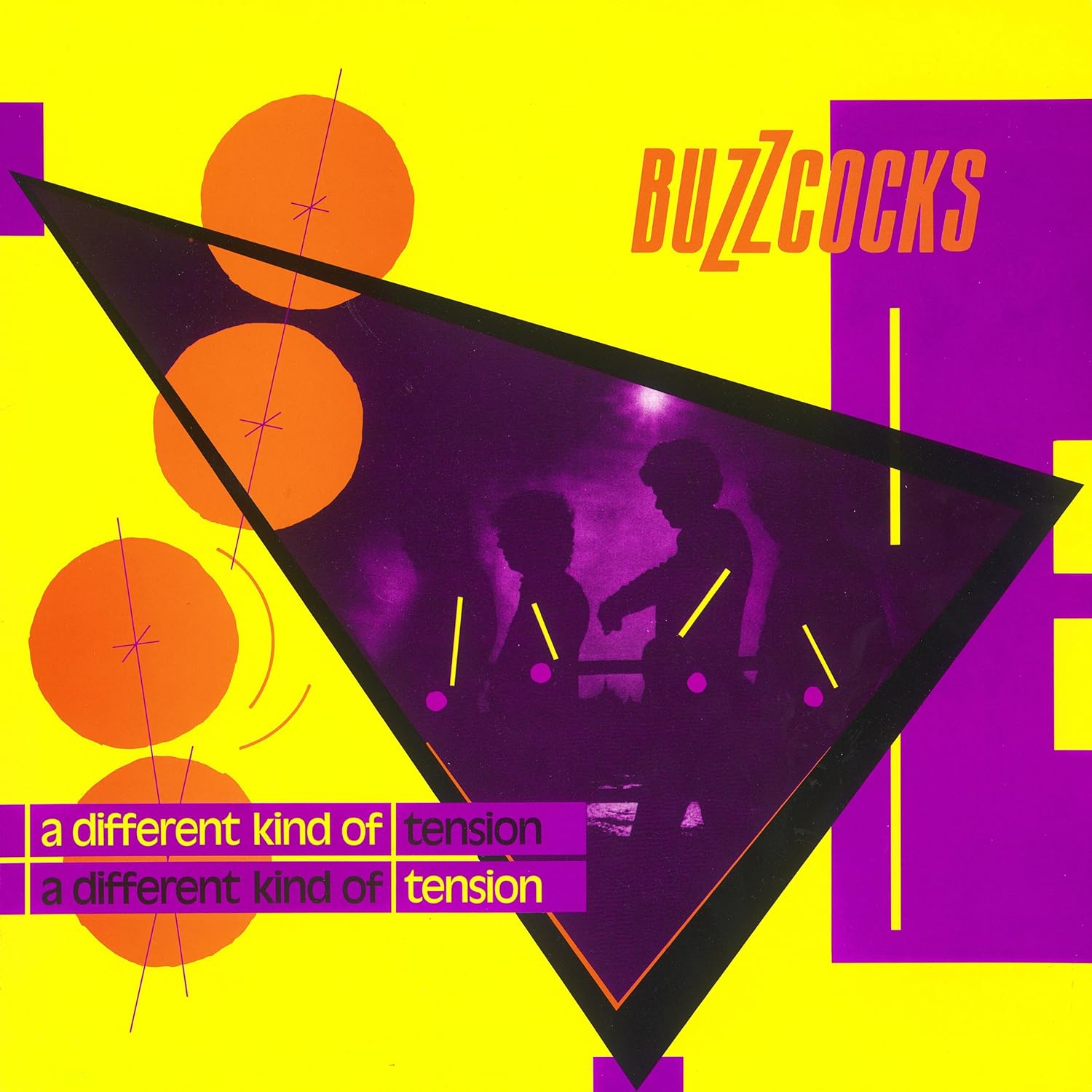
Malcolm Garrett who designed many of the Buzzcocks album designs also incorporated a lot of collage into his works. He was directly influenced by Russian Constructivism posters, and especially by the work of El Lizzitsky, who worked with geometric shapes and triangles combined with straight lines and dramatic forms.

Figure 2, A Different Kind of Tension, Malcolm Garrett, 1979
Garish, clashing colours have been used, just like in the day-glo bright sleeve of Never Mind the Bollocks (Figure 2). Designers were experimenting more with colour at this time, using uncomfortable colour combinations which in theory should have been disastrous but in practice suited the message and ethics of the bands- loud, in your face, and not going anywhere soon. 

Figure 3, Movement, Peter Saville, 1981
Of all the contemporary graphic designers, Peter Saville is definitely one of the best known. Producing album covers for Joy Divison and New Order, he gained rapid popularity in the music world.

His album covers were sleek and sophisticated, communicating a much more mature and adult message than the raw punk albums. In the above New Order album design (Figure 3), in contrast to both the Sex Pistols and Buzzcocks, it uses harmonious colours which are unnoffensive to the eye and a simple but well thought-out design, and the streamlined design of the below Joy Divison cover also shows this (Figure 4). 

Figure 4, Unknown Pleasures, Peter Saville and Joy Division, 1979
"During this period, while the rest of the general design palette turned Day-Glo, Saville's own tastes veered more toward the classical." 3


List of Illustrations

Figure 1, Never Mind the Bollocks, Jamie Reed, 1977, THORGESON, S. & POWELL, A. 100 Best Album Covers, Dorling Kindersly, 1999, p.p. 106-107
Figure 2, A Different Kind of Tension, Malcolm Garrett, 1979, THORGESON, S. & POWELL, A. 100 Best Album Covers, Dorling Kindersly, 1999, p. 47
Figure 3, Movement, Peter Saville, 1981, KING, E. & YORK, P. Designed By Saville, Freize Publishing, p. 69
Figure 4, Unknown Pleasures, Peter Saville and Joy Division, 1979, KING, E. & YORK, P. Designed By Saville, Freize Publishing, p. 129

References

[1] THORGESON, S. & POWELL, A. 100 Best Album Covers, p. 106
[2] THORGESON, S. & POWELL, A. 100 Best Album Covers, p. 107

[3] KING, E. & YORK, P. Designed by Saville, p. 13

Bibliography

KING, E. & YORK, P. Designed by Saville, (2003) Freize. London
THORGESON, S. & POWELL, A. 100 Best Album Covers, (1999) Dorling Kindersly. London

Thursday, 27 February 2014

The 1960s

Task

Research Pop Art

In this task I am researching American Pop Art, focusing on Roy Litchenstein and Andy Warhol in particular. To me, these are two of the most well-known artists in American Pop Art and so I wanted to learn about them in more depth.

Pop culture became closely interwined with lifestyle in the 60s, especially in the USA. Consumerism was just reaching its first peak after the Second World War and artists reacted to this with Pop Art- employing aspects of mass culture such as advertising and comic book art and mundane everyday objects (think Warhol's soup cans). Because of the way artists would use found objects and images, the movement was similar to Dada art, and although the concepts behind each were different, there were similarities in the attitudes of the artists.

"What was it which made Dada so inspiring for the development of Pop Art? Dada combined advertising images and texts, slogans, revolutionary pamphlets, folk art and popular culture in collages, pictures with texts, photos, films... The unorthodox, and in some ways surreal, manner in which it combined these, integrating both the rational ordering principle and elements of chance, influenced Pop Art and the Happening towards the end of the fifties." 1

After struggling to secure a one-man show in his name, Andy Warhol finally managed to get an exhibition in place after painting a series of dollar bills which Eleanor Ward challenged him to create.

"As Warhol remembers it, the three of them met and, after De had asked her point-blank if she was going to take Warhol on, "She took out her wallet and looked through the bill compartment. Then she held up a two dollar bill and said, 'Andy, if you paint me this, I'll give you a show.'" 2
The reaction to this first show of his was immense, and the Manhattan art world loved it. Andy Warhol was famous.

Figure 1, Two Dollar Bills (Front and Rear), Andy Warhol, 1962

Following this came his images of Monroe and Elvis- the constantly repeated images of their faces on garish backgrounds in block colours dehumanised them, and reveal the inauthenticity of their characters. Warhol has transformed them into a series of meaningless pictures, transfering them onto the canvas in an almost careless way, making her marketable persona something very alien and unpredictable.
"Critics would choose to see Warhol as a social commentator, a painter using the devices of commercial art to expose the mediocrity and exploitiveness of popular culture... It must be understood, though, that Warhol likes best those whose images shine the brightest- better yet, those who are images. Warhol likes stars." 3
Figure 2, Red Elvis, Andy Warhol, 1962

In comparison to Warhol's bold, brash and quite inelegant works, Roy Lichtenstein's are well-finished, and underneath their content offer a sophisticated variant on typical Western modernism. He used comic strips as his main inspiration, although he was also inspired by popular advertising, and his works often had themes of humour and parody in them. His style was typically bold, thick lines, along with the prominence of Ben-Day dots (imitating printing techniques at the time), again inspired by comic strips.
 
Figure 3, Drowning Girl, Roy Lichtenstein, 1963

Lichtenstein wanted his images to look machine made, although deep down he was always a painter, and unlike Warhol, he almost never used or took photography as a base for his work. His works always retained a sense of traditional methods, no matter how hard he tried to make them look machine made. He preferred to use hand-drawn figures from anonymous artists that held no particular interest or value to them.
"Tension is created between the look of an anonymous drawing style and the knowledge that an individual artist did actually execute a commercial image. A remainder of the human hand remains inherent to the drawing process itself, however impersonal it may seem." 4

List of Illustrations

Figure 1 Two Dollar Bills (Front and Rear), Andy Warhol, 1962, OSTERWOLD, T. Pop Art, Taschen, 2003, p.132
Figure 2 Red Elvis, Andy Warhol, 1962, RATCLIFF, C. Warhol, Cross River Press, 1983, p.28
Figure 3 Drowning Girl, Roy Lichtenstein, 1963, HENDRICKSON, J. Lichtenstein, Taschen, 1993, p. 31

References

[1] OSTERWOLD, T. Pop Art, p. 136
[2] RATCLIFF, C. Warhol, p.26
[3] RATCLIFF, C. Warhol, p.28
[4] HENDRICKSON, J. Lichtenstein, p.25

Bibliography

HENDRICKSON, J. Lichtenstin, (1993), Taschen. London
OSTERWOLD, T. Pop Art, (2003), Taschen, London
RATCLIFF, C. Warhol, (1983), Cross River Press